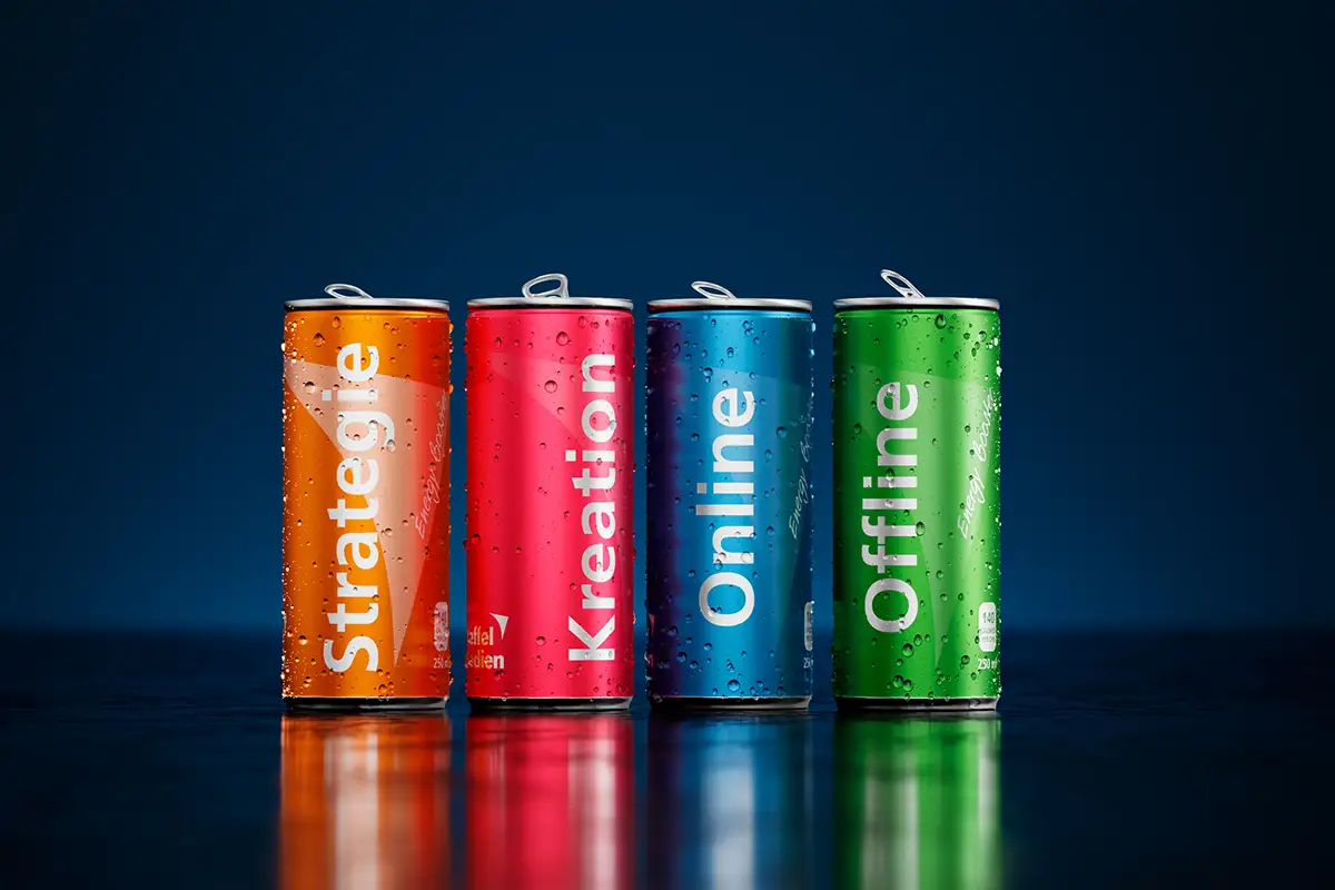
… or the color makes the difference

Imagine a world without colors. Can’t you? Neither do we, because colors allow us to see the world with different eyes. They trigger emotions and reactions in us, evoke associations and can even influence our purchasing behavior
Colors and effect
We encounter colors every day, from the moment we open our eyes. But do we think about the meaning of these colors or how they affect us? The brain has a unique way of processing colors, which in turn means that it is stimulated by different hues. Colors can increase appetite, create alertness or tiredness, reduce tension and much more.
Colors are a kind of non-verbal communication and specifically address our emotions and feelings. This makes color an extremely powerful means of design and extremely important for communication and advertising.
Color theory is a science that deals with the meaning of a color. With an awareness of the effect, you can harness the power of colors. But not every one is suitable for everything, because there are factors such as culture, color combinations or shades and tones that can have an influence on the meanings. For example, red symbolizes happiness, joy and prosperity in Asian cultures, but in the Catholic Church it symbolizes blood, fire and suffering, as well as the different effects of shades such as wine red or rose red.
Color choice for companies
Color theory is a complex science and also an art that should not be underestimated. In order to use the power of color psychology, it is important to deal with the meanings of color. This allows you to choose the right color for the desired message, whether for logos, business cards, websites, business stationery, social media, emails, presentations, flyers, products or others.
It is important that the use of colors is consistent with the design of the website, logo, advertising or general company communication. In this way, they can be used for branding and the all-important recognition value is created. When deciding which colors best suit your brand, your company or your marketing, you should take several aspects into account. Brand and product characteristics, target groups or even the message to be conveyed. Despite this attention, not every person can be reached because the color effect ultimately always remains subjective.
The color wheel
The smallest base of the color wheel consists of the primary colors red, yellow and blue. If you mix these together, you get the secondary colors orange, green and violet. This color wheel is complemented by the neutral colors black, grey, white and brown.
Red
Attracts attention, stands for
Love and stimulates the appetite.
+ passionate, strong, courageous,
Active, warm, brave,
energetic, exciting
– dangerous, aggressive, arrogant,
angry, dominant
Yellow
Radiant color that attracts attention
and for summer, sun
and cheerfulness.
+ cheerful, optimistic, fresh, light, happy, open, communicative, liberal
– dangerous, envious, greedy,
jealous, selfish,
toxic, intrusive
Blue
Inhibits the appetite, promotes
Productivity and conveys security
and trust.
+ calm, credible, reliable,
Professional, honest, loyal,
relaxing, serious, cooling
– Cold, sad, impersonal,
boring
Orange
Stands for self-confidence,
Joie de vivre, humor, exuberance
and curiosity.
+ youthful, enthusiastic, vital, friendly, creative, inviting, optimistic, warm
– warning, dubious, childish,
artificial, intrusive, restless
Green
Provides relaxation and is the
Color of fertility, happiness,
Hope, growth and the environment
+ natural, relaxing, positive,
harmonious, healing,
relaxing, regenerating
– jealous, immature, sour,
bitter, inexperienced
Violet
Has a calming effect and stands for luxury, wealth, magic and transformation.
+ mystically imaginative, spiritual,
creative, wise, emancipated,
fashionable, original
– unnatural, restless, unapproachable,
eccentric, artificial, vain
Black
Associated with mourning and death,
but also with positive characteristics.
+ elegant, powerful, serious, formal, modern, classic, neutral,
factual, sporty
– Threatening, oppressive, dark,
gloomy, distant
Gray
It is often used as a typical business color and stands for professionalism.
+ professional, formal, discreet,
elegant, modern, reliable, businesslike, reserved
– dreary, unemotional, conservative,
boring, depressing
White
Thanks to its neutral and
emotionless character is the
Effect difficult to grasp.
+ pure, clean, simple, objective,
modest, sensitive, innocent
– Cold, sterile, colorless, boring,
empty, unapproachable
Brown
For the topics wood, coffee,
Chocolate and nature/environment
in use.
+ warm, secure, reliable, traditional, grounded, natural, practical
– dirty, heavy, sad,
conservative, boring
Glamor
To add a touch of glamor to a brand or its communication, metallic colors such as
Gold, silver or bronze – especially in combination with black – can be used. These stand for luxury, success, prosperity and growth.
Color is an important means of recognition, whether for small or large companies. If you want to use colors as a successful marketing tool, you have to use them in a targeted way and know their effect and meaning. The interplay of several colors, typography, images and illustrations also determines the overall effect of a design – online and offline.
