Brand presence for start-ups: from the logo to the homepage
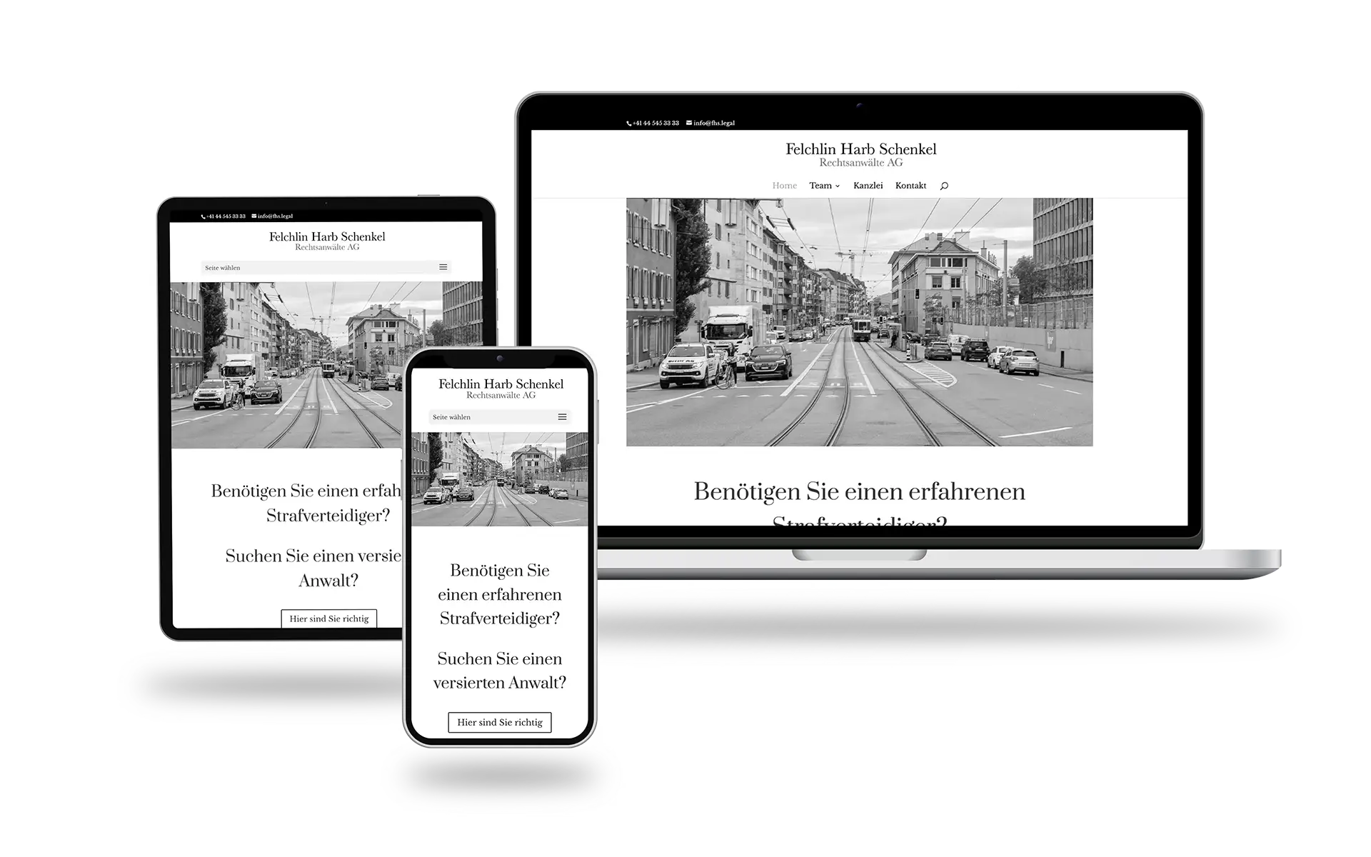
The brand identity of the law firm Felchlin Harb Schenkel is deliberately kept very sober and reduced. Muted colors from the black space and condensed general information are combined with a comprehensive professional presentation of the individual lawyers who provide the legal services.
We realized the following components for the brand presence:
- Logo design
- Business stationery
Business cards, envelopes, letterheads and flyers - Homepage
- Photography and image processing:
Portraits and decoration pictures of the homepage
It all starts with the logo
Everything is nothing without a logo! The logo is the first visual identifier of a brand. Here, the logo consists of the typographically realized name of the law firm. A serif font is chosen that fits perfectly into the legal environment. A short logo for various applications was also implemented in simple black and gray tones.
Business stationery for daily correspondence
Working as a lawyer involves a lot of writing every day. To ensure that the correspondence arrives in an appealing manner and can be immediately visually assigned to the sender, it is designed in accordance with the CI/CD and thus conveys the brand to the recipient.
Contacts are important. Business cards contain the most important data and are designed in line with the brand.
Minimalist homepage with a focus on employees
The homepage of Felchlin Harb Schenkel Attorneys at Law offers the most important information about the young company in a condensed form. The focus here is on the employees who provide the legal services. Here, each lawyer’s brief CV, training and preferred areas of law are described and illustrated with a striking photo.
Photography and image processing
We not only took portrait photos of the employees, but also decorative and atmospheric photos of the surroundings of the law firm. The images were edited and prepared for the various media.

