Ty•po•gra•fie
the style the arrangement the appearance printed letters on one side
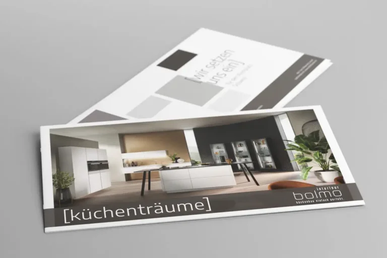
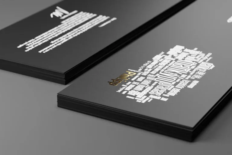
Typography is the art of making a statement. Correct and well-written text is your business card in written communication. It makes your messages more legible and customer-friendly. Typography is as old as letterpress printing. We cultivate this tradition and bring it into the modern age. We have two pairs of eyes: one for the big picture, such as type area, fonts and font sizes, and one for details such as character and line spacing. We are happy to put the finishing touches to your words and go into great detail. From the correct hyphen and spation to the pagination, everything has to be right – only then are we satisfied. Whether it’s a creative art poster or an informative annual report: we will set your text until the last word is perfect. Tricky tasks are the salt in the soup for us.
Typography - the right combination of fonts
To generate more attention and excitement among recipients, we look for the perfect layout for advertising materials such as flyers, advertisements, brochures, websites, etc. We freshen up layouts with colors, graphic elements and images. Another element that should not be forgotten are the fonts.
In the early days of letterpress printing, usually only one typeface was used. If you wanted to emphasize something, you chose a different font size or white spaces between the characters. But today there are “almost” no limits to the choice of fonts. For more attention or to emphasize passages, we use different sizes, “bold & light” or even mix the fonts. This is certainly a good approach, but “sometimes less is more” or “it’s all about the right mix”.
Fonts: More than letters
For websites, design and layout are crucial for the user experience. Fonts play an important role in design and form one of the foundations of design.
In order to achieve an effect when mixing fonts, the contrast between the fonts is important. Here are a few typographical examples:
Tip 1:
Tip 2:
Tip 3:
Tip 4:
Tip 5:
Tip 6:
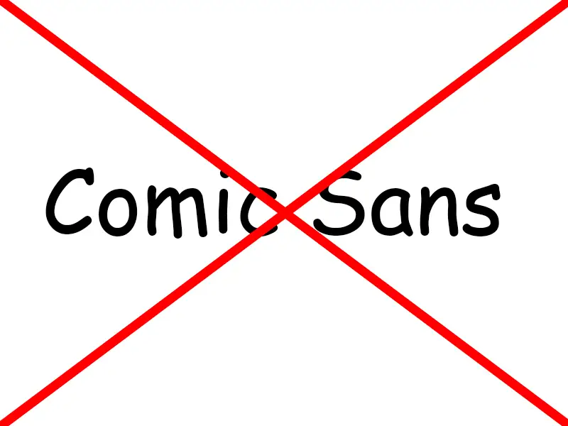
The obligatory “no goes” when choosing a font:
- To ensure that a text or advertising medium does not appear too chaotic, no more than three fonts should be mixed together. It is not impossible, but rather difficult!
- Visually similar fonts should be avoided. In such cases, the font blending looks rather unintentional and like a mistake.
Be creative and have the courage to write!

* Mandatory fields
Information on data protection, revocation, logging and the performance measurement covered by the consent can be found in our privacy policy

Reno Meier
044 289 89 13


